Reseller Dashboard
Visualizing reseller finances beyong the spreadsheet

01. Overview
2026 May
Exploring how independent resellers could manager their business finances more clearly, by moving from dense spreadsheets to a structured dashboard with dual-currency support.
Disciplines:
UX Research, Information Architecture, UI Design, Interaction Design, Prototyping
Tools:
Figma, Figma Make, Cursor, Claude Code
01. Case Background
Imagine yourself wanting the newest beauty drop from Korea, a cut of meat you can only find in Spain, or a limited item of your favorite artist sold in a specific region. When regular retail doesn’t carry it, you find someone who sources it for you: a reseller.
These business often start from something as simple as bringing things back from a trip. With a simple start comes simple tools. For most resellers, that tool is a Google Sheet. And for a while, it works. But as the business gets serious with more items, fees and even different currencies, the data outgrows the spreadsheet, and the numbers start to feel like a puzzle.
The nature of a spreadsheet is that it can get messy. Unlike a company with an accountant, a reseller alone handles every sale, expense and profit calculation. However, with one person both inputting and reading the data, rows of numbers collected can quickly become blobs of text. Important figures get buried under layers of calculation.
Resellers have used spreadsheets for years, the familiarity has value, so the goal isn’t to replace the spreadsheet. But when the numbers get dense, a tighter compact system can help boil it down. And so this dashboard was built on the logic of the spreadsheet, just presented in a way that makes important numbers more readable.
01. The User
*This persona is assumptions-based, built from observed reselling behavior and publicly available patterns rather than user interviews.

Reseller
Sourcing European goods and selling to the US market
CURRENCY
USD
EUR
TOOLS & DEVICE
Laptop
Google Sheets
Calculator
CORE QUESTIONS
Am I making profit this month?
What inventory do I currently have?
Where are my expenses going?
What’s selling, and when?
03. The Research
To make sure the project is realistic, the starting point was to use a real reseller spreadsheet sold online. It kept everything structured but flat, with all data compacted into one view. As you make inputs, the list gets longer, and reading requires more mental work. It confirmed that the data model is solid, but presentation was the problem.
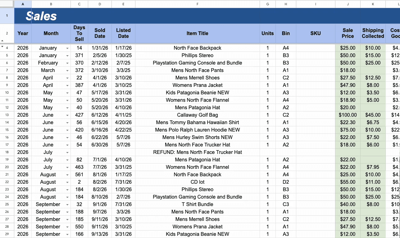
Long list of data causes user fatigue
From there, I found and audited Flipwise, which is the closest existing product to what this dashboard needs to be.
The software separates inventory from sold items, tracking how long items have been listed as well as where they’ve been purchased, items counts versus profit, and can generate tax files.
However, Flipwise is built around eBay’s API, which means it only works if you sell exclusively through one platform, with no multi-currency support. With this connection, the data inputs are all automated. Although it makes it simplistic to the seller, but reseller through multi-platforms would result in more editing and listing than the full automation. What’s to note is these would be good references for building the framework.

Common Reseller Spreadsheet
Flipwise
structured data listing
simple & easy to handle
data mapping and architecture is solid
automated feature so user doesn't have to update manually
long lists of data causes fatigue and hides trends
poor data visualization
only works for eBay's platform
no multi-currency option
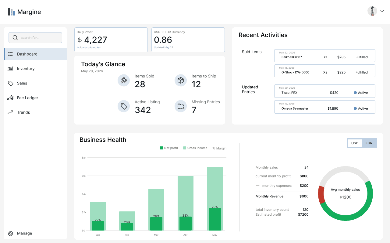
04. Design Decisions
Multi-currency and the switches (currency flexibility)
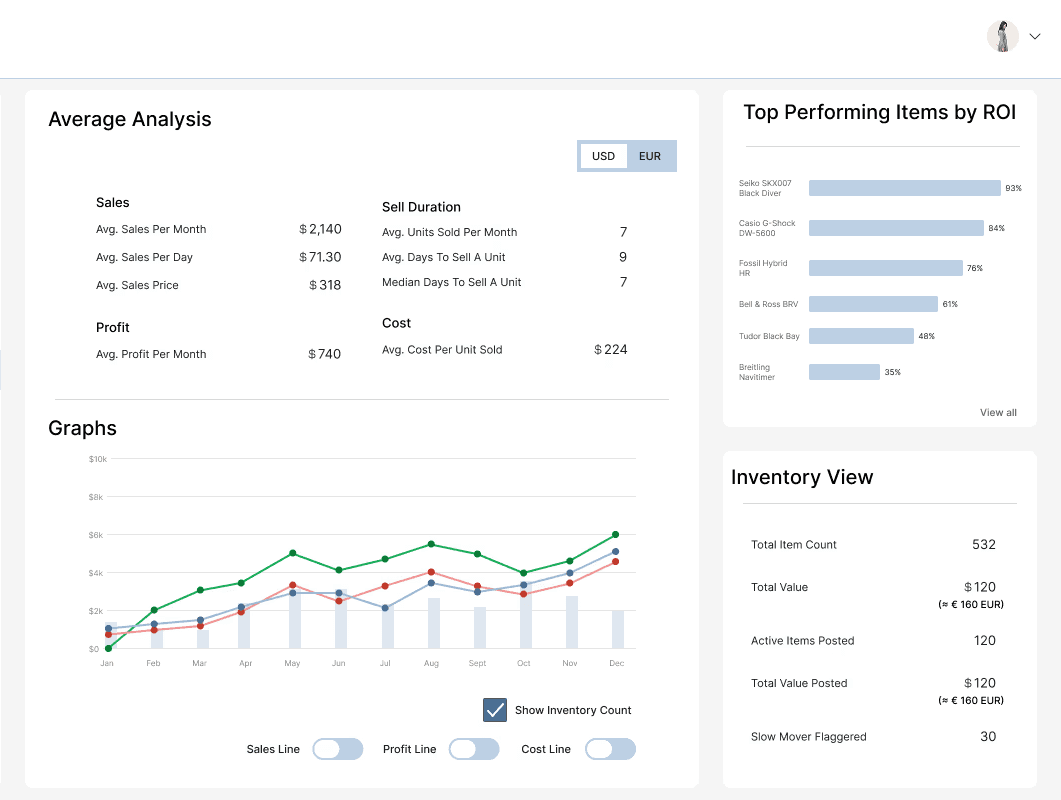
We’ve set that the reseller’s capital is in USD, but most purchases happens in EUR. That means while they need to prioritize viewing currencies in USD, real decisions come out of what they can afford to source next, which will be in EUR. It wouldn’t be practical for all figures to be able to convert to both currencies all the time, due to target consumers paying in USD, but for central management of funds, it would be useful to view in the other currency.
Therefore, a currency selection was built in certain areas to oversee the big picture ①. While for the inventory, sales and fee ledger, the data tables include a currency column ②, because not every transaction happens in EUR and the cross reference of currencies can help item prices labeling. The final calculation always resolves in USD, but conversions are there to assist in the process ③.
① Currency toggle for in the business health section

② Tables include a currency column

③ Built-in cross-currency reference in the product details panel


06. Reflections
Structurally
There would be at least 4 things to improve structurally if we were to continue refinement.
API import:
This would be the most impactful improvement. Connecting directly to selling platforms to automate data input as like Flipwise. However, it does come with constraints around which platforms support API access and how transaction data maps across them.
Built-In tax exporter:
This would be an added feature within Fee Ledger, presumably in the Export function, which would save resellers time going through all the records.
Responsive Design for Other Devices:
Due to the data-dense and input-heavy nature of the dashboard, desktop/laptop first was the starting point. However, resellers aren't always at a desk. A tablet version would be the next step before mobile, as it preserves enough layout to keep data readable while being lighter and more portable.
Establish Item Input Flow:
This was an area intentionally left out of this project's scope. However, a brief wireframe was drafted to support the concept. The reseller would input a new item into the inventory with the currency rate at the time of purchase and select the status for it to be ported into the Sales board.

Visually
Whether a grid display for numbers and stats would add structure or simply add visual weight to an already data-dense viewport is a question worth exploring in the next iteration.
07. AI Involvement
AI was used deliberately at each stage to add constraint, assist exploration and render the final HTML interactive prototype.
Before jumping into AI, the color scheme, typography, and initial wireframes were set independently first. Then, AI was used to generate a design foundation script based on the lo/mid-fi wireframe, which produced color tokens, type scales, spacing and component references. However, not everything generated was used, because it produced more component types than the design needed. Some were adapted, while others were edited or removed.
In prevention of reaching token limitations and inefficient one-by-one element movement, the basic model of the hi-fi wireframe was first created in Figma, before fed into Figma Make, which threaded the 5 frames together into code. The code was then taken into Cursor and Claude Code to render a working interactive prototype, which produced a more functional result.
Addendum - Sources
Reseller Spreadsheet: Referenced through Jason Hayes video where he previews his best selling reseller spreadsheets
Flipwise: Referenced through their official website and relevant videos