From Web to Wardrobe:

BlackMilk App Concept

01. The Overview

This case study showcases my 2-3 month self-initiated concept to design a mobile app for BlackMilk Clothing. BlackMilk’s web experience is bold, but their loyal customers lack a mobile-first way for purchase. This concept explores how a dedicated app could retain brand personality while streamlining browsing and discovery

The Galaxy in Black & White

Brand Specifics

BlackMilk Clothing is known for its bold, pop-culture inspired, alternative fashion and a strong community following. Founded in 2009 from a kitchen table selling leggings through a blog, the brand embraces vibrant, nostalgic, and unapologetically expressive style, embracing Y2K’s maximalist, fandom-driven aesthetics

Primary Users

Style-conscious, fandom-loving shoppers who follow collection drops closely and browse on the mobile. They value quick, clear navigation and visually inspiring content

02. The Ask

Weaving the Web to App

Challenge

How can we translate BlackMilk’s visually expressive and extensive web presence into a mobile app that reduces complexity, supports fast drop-based shopping, preserves their signature look-book driven style and still leaves space for exploration

Solution

Applied Hick’s Law to streamline categories for faster decision-making and reduce cognitive load, while following Occam’s Razor to keep only essentials UI elements. This created a balance between the brand’s bold expression with quick but exploratory navigations that aligns with mobile browsing habits

02. The Progress

Tailoring the Flow

Website Site Map

Dense menu with duplication and early choice overload
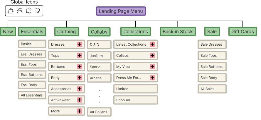
App Mapping

Redesigned with a supporting Quick Access Menu, reduces duplication and balances efficiency with discovery through progressive disclosure

Click here to check out the process

Redistributing Effort in User Flow

The need/brand behavior:

BlackMilk’s releases most products through limited collections, users often return to check for what’s new, restocked, or discounted

This balance between reduced taps for high-intent actions and structured exploration reflects the core goal of the restructuring: less overload, more purposeful discovery

This balance between reduced taps for high-intent actions and structured exploration reflects the core goal of the restructuring: less overload, more purposeful discovery

The idea:

Prioritize high-intent actions like New Arrivals and Restocks at the menu entry, reducing effort for returning users. Broader browsing flows take slightly more steps, but with clearer structure to support intentional discovery

Flow 1: Returning User (quickest path to new/returning items)

Flow 2: Exploratory Users (structured browsing across categories)

Flow 3: Intentional Users (deeper, goal driven navigation)

Fabricating the Frame

Scroll me

Menu

The frame designs foreground product imagery and sparks curiosity by featuring the newest releases upfront, drawing attention without overwhelming choice. This approach reduces cognitive load early in the journey while still allowing exploratory discovery and intentional browsing

Here, the Quick Access top bar balances immediacy and flexibility. With just one tap away, whether they’re browsing for inspiration or searching with intent, users can explore the brand in their own direction

Scrollable Content
Scrollable Content
Scrollable Content
Scrollable Content

Menu

The frame designs foreground product imagery and sparks curiosity by featuring the newest releases upfront, drawing attention without overwhelming choice. This approach reduces cognitive load early in the journey while still allowing exploratory discovery and intentional browsing

Here, the Quick Access top bar balances immediacy and flexibility. With just one tap away, whether they’re browsing for inspiration or searching with intent, users can explore the brand in their own direction

tap & scroll to view

Pattern Cutting

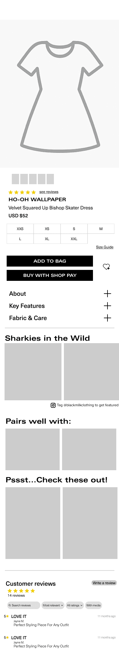
All foundations (typography, color, grid) were aligned with BlackMilk’s existing web design to ensure cross-platform brand consistency

Font:

Zurich and Neue Haas Unica Pro were chosen to balance expression and usability. Zurich provides bold headers and callouts for strong hierarchy and brand impact, while Neue Haas Unica Pro supports  body and subtext with clarity and flexible weights for readability

Font:

Zurich and Neue Haas Unica Pro were chosen to balance expression and usability. Zurich provides bold headers and callouts for strong hierarchy and brand impact, while Neue Haas Unica Pro supports  body and subtext with clarity and flexible weights for readability

Color:

Primary black, white and accent purple were selected as the base palette. From these, a 100-900 scale system of the colors were developed to ensure consistency, hierarchy, and flexible application

Color:

Primary black, white and accent purple were selected as the base palette. From these, a 100-900 scale system of the colors were developed to ensure consistency, hierarchy, and flexible application

Icon:

Icons were created by a 22*22px frame to ensure clarity and balance. Custom icons were created for BlackMilk’s specific needs, while Phosphor Icons were integrated to maintain scalability and visual harmony across the experience

Icon:

Icons were created by a 22*22px frame to ensure clarity and balance. Custom icons were created for BlackMilk’s specific needs, while Phosphor Icons were integrated to maintain scalability and visual harmony across the experience

Grid Layout:

Designed on an iPhone 16 frame with a lightweight spacing system across the app, with tighter padding for imagery and wider padding for text to improve readability. Section spacing is integrated into these values, keeping layouts clean and consistent without adding unnecessary rules

Grid Layout:

Designed on an iPhone 16 frame with a lightweight spacing system across the app, with tighter padding for imagery and wider padding for text to improve readability. Section spacing is integrated into these values, keeping layouts clean and consistent without adding unnecessary rules

03. The Showcase

The Final Stitch

Try the prototype in figma

Don't have time?

I'll walk you through instead!

04. Closing

Closing the Seam

To Summarize

This concept reimagined BlackMilk’s web experience into a mobile app that reduces overload, highlights high-intent actions, and supports purposeful discovery by restructuring navigation and redistributing effort. By balancing both efficiency and exploration, the design shows how a bold brand identity can coexsist with a seamless, habit-driver user flow

Lessons Learnt

Strategy and Details Matter: Laying down a map and making strategic choices early proved valuable, the small details consistently reinforced the larger design goals

Consistency Builds Clarity: Using a structured design system kept the app cohesive and reduced friction in decision-making, showing how consistency supports both speed and quality

Balancing Innovation with Practicality: Not every idea had to be groundbreaking, sometimes the most effective solution was the simplest one delivered within scope

Good work begins with listening. 
Send me a message, let's start a conversation!

dotjosie 2026 · imported from Taiwan, powered by tea & open skies in Dayton, Ohio

Good work begins with listening. 
Send me a message, let's start a conversation!

dotjosie 2026 · imported from Taiwan, powered by tea & open skies in Dayton, Ohio

Good work begins with listening. 
Send me a message, let's start a conversation!

dotjosie 2026 · imported from Taiwan, powered by tea & open skies in Dayton, Ohio